Create Landing Page For Free: The Ultimate Guide
Today we’ll learn how to create landing page for free.
Landing page that:
- Converts better.
- Looks Professional
- Is SEO optimized.
- And fits a low budget.
Let’s dive in!

Table of Contents
Introduction to Landing Page
I’ve to kick this landing page ultimate guide off with a basic overview.
Because it helps to establish the context, importance and clarity.
And in this first chapter, I’m going to cover the basics of landing page.

Understanding the Landing Pages
So, what are landing pages, exactly?
A landing page is a standalone web page with a specific purpose. Unlike standard website pages, landing pages focus on a single objective. They guide visitors toward a specific action. This could be signing up for a newsletter, filling a form, or making a purchase.
For example, imagine a company launching a new fitness app.
Instead of sending users to their homepage, they create landing page. This page highlights the app’s benefits, includes user testimonials, and features a prominent call-to-action button.
Here’s an example of a landing page I’m working on.
By removing navigation options and distractions, I direct visitors to what matters most- the action I want them to take- leading them smoothly through the sales funnel. This focused approach captures attention and drives actions.
What's the difference between landing page and website?
A website is a collection of pages with all the details about a business—services, staff, events, and more.
Let’s take an example.
If you own a gym, your website will have info on classes, job openings, trainers, activities, and memberships. It gives a broad view of your business.
A landing page is different. It’s a single page with a clear goal, usually for one specific offer or campaign.
For example,
if you’re promoting calisthenics classes, you create landing page focused only on calisthenics. Visitors from your ad will see just this class.
It’s simple, focused, and designed to get them to sign up without distractions.
How Landing Pages Drive Conversion
Now that you know what makes landing pages unique, let’s dive into how they actually drive conversions.
Landing pages guide visitors toward a single action & they strip away everything else to keep the focus on your offer. By removing unnecessary elements like navigation menus, multiple links, or competing messages, landing pages capture attention. This clarity helps increase the likelihood that visitors will follow through.
Take a look at the comparison below.
You’ll see a full website for a product, filled with options and distractions. Right below that is a focused landing page for the same product.
Test Yourself:
Which one gives you the strongest urge to buy? The multi-option website or the single-focus landing page?
This exercise shows why landing pages convert better. They strip away distractions and lead visitors directly to the action you want them to take.
By focusing on a single goal, they turn traffic into tangible results.
What are High Converting Landing Pages
A landing page that converts well is a valuable asset. But what exactly qualifies as a “high-converting” landing page?
Typically, a landing page with a conversion rate of 10% or higher is considered high converting. The average landing page conversion rate falls between 2% to 5%. Anything below 2% means there’s room for serious improvement. It indicates that the page isn’t effectively guiding visitors to take action.
Here’s a visual breakdown:
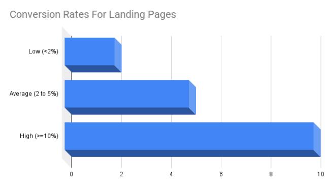
It’s important to note that there are no hard rules for these percentages. Conversion rates can vary significantly by industry, but on average, these ranges apply.
Creating high-converting landing pages for your business can double or triple results. It’s the difference between a trickle of leads and a steady stream of new customers.
In short-
if you’re creating landing page or optimizing it,
your goal should be clear: aim for a conversion rate above 10% for the best results.
Types of Landing Pages
Landing pages come in various types, each serving a specific purpose. Understanding these types is crucial for creating the right landing page for your business.
Lead Generation Page
Lead generation pages are designed to collect visitor information, like email addresses. These pages often offer free items or lead magnets to get you to share your details and encourage future purchases.
The newsletter subscription pages you see are the lead generation page.
Here’s an example of a lead generation page.
This landing page is straightforward, with no distractions like navigation menus or pop-ups.
It focuses on one thing: offering a free workshop as a lead magnet.
To get access, you’re required to provide your details, like name and email.
Once you’re in, if you find value in her free content, you might consider buying her next paid course.
By offering free content, like a pre-recorded workshop, this landing page gathers leads who may eventually convert into paying customers.
That’s how lead generation pages work—using free offers to collect contact information and nurture potential customers for future sales.
Product Launch Page
These forms of landing pages create excitement about new products before their official launch. This could include notifications about the launch date, special offers, or exclusive access to early purchases.
For instance, when Apple announces a new iPhone, their product launch page often features an email subscription option, inviting users to stay informed about the launch details and exclusive offers, building anticipation before the official release.
Here’s how it could look.
This product launch landing page is simple and effective.
It removes barriers by offering a no-obligation pre-order, allowing visitors to engage without committing right away. This builds trust.
Brochures cater to different customer needs, keeping the page clean and organized.
But there’s room for improvement. Urgency is missing—there’s nothing driving immediate action. The text in the hero section isn’t easy to read, which weakens the message.
Overall, it works—but with clearer text and some urgency, it could work much better.
Product Sales Page
A sales page is designed to drive immediate purchases.
Its goal is to persuade visitors to buy the product or service right away by highlighting its value, addressing pain points, and creating urgency.
For example, a sales page for a new smartphone might show its key features, include positive customer reviews, and offer a limited-time discount to encourage visitors to buy now.
It answers, “why this product?” and “why now?”.
Here’s the outlook of a MacBook Pro sales page from Apple:


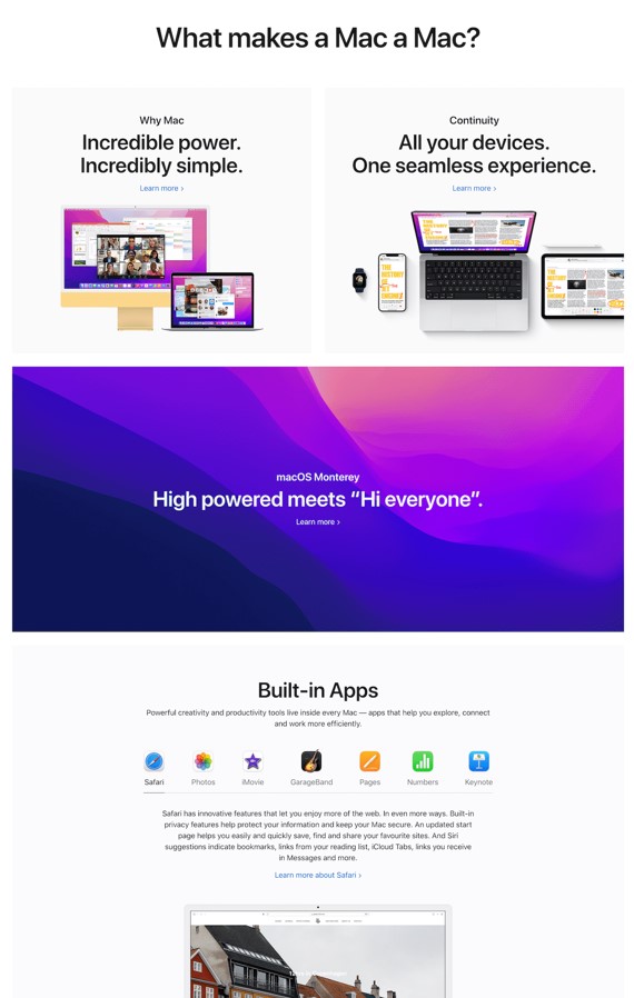

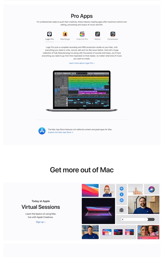


This product sales page is designed to spark interest and drive MacBook Pro sales.
It walks you through the product’s features, making it easy to see why it’s worth the investment.
The clean layout and visuals keep you focused, while each section pushes you closer to making a purchase.
By the end, you’re guided to feel confident in choosing the MacBook Pro, moving seamlessly through the sales process.
Beside these, you may hear about click-through landing pages, event registration landing pages, or squeeze landing pages. Don’t worry. These are typically just variants of the types discussed above.
Setting Up the Basics
By now, you’ve learned what a landing page is and how it can drive conversions.
Next, you’re likely thinking: “How do I start to create landing page?”
In this chapter, I’ll guide you through the basics of domains, hosting, and an introduction to WordPress—arguably the best platform for beginners.
Plus, we’ll cover where and how to start learning WordPress so you can confidently set up your landing page.


Domain & Hosting
To create landing page for your business, you’ll need two essential components: a domain and web hosting.
Don’t worry—I’m here to guide you through it!
What is a Domain?
Think of your domain as your website’s address. It’s what people type in their browser to find you.
For example, youtube.com is a domain.


Domain prices start as low as $10 to $15 per year, and you’ll need to renew it annually to keep your online presence.
What is a Hosting?
If the domain is your address, then hosting is the actual space where your website lives.
It stores all your files, images, and content, making your landing page accessible on the internet.
Hosting costs can vary, starting at around $5 to $10 per month. Just like your domain, you’ll pay for hosting on a recurring basis.
But no worries—there are plenty of offers throughout the year, allowing you to secure a domain and reliable hosting at much cheaper prices.
For example, I got mine for just $35.40 for the entire year.
It’s an affordable investment for getting your landing page up and running!
Why Choosing the right domain and hosting matters?
For your brand, what matters the most is trust. And when it comes to building trust and credibility, the name and hosting providers you choose are paramount. They enhance smooth experience for your users, and protection of your data.
Why is the right domain essential?
Your domain is often the first impression potential customers have of your business. It plays a crucial role in establishing trust and connection with you or your brand.
Think about it:
If you’re looking for a gym and come across two landing pages—one at bestgym.com and the other at fitnessexample101.com—who would you be more likely to trust?
The same applies to you, your brand and your business.
If a domain that matches your business name is available, it’s worth considering—even if it means paying a little premium. If not, opt for something that closely aligns with your brand or is suitable.
Why about hosting?
Your hosting is what keeps your website up and running smoothly. It’s like the foundation of your online business.
Good hosting ensures your site loads quickly and stays online, even during high traffic. It also provides security, protecting your website from hacks or data breaches.
Choosing the right hosting means you’ll have a fast, secure, and reliable website, which helps build trust with your visitors and keeps them coming back.
I’m not endorsing any specific hosting provider, but based on my review of reliability, speed, security, customer support, and scalability, some of the top options include Bluehost, SiteGround, HostGator, and DreamHost.
Ultimately, you should choose the one that fits your budget and best supports your business goals.
Introduction to WordPress: The best platform for beginners.
Now that you’ve secured a reliable domain and hosting, it’s time to create landing page.
When it comes to designing landing pages, there are a few platforms to choose from—like Wix, Squarespace, and Shopify. But WordPress stands out as the best option for beginners.
Why?
It’s user-friendly, flexible, and allows you to create landing page that’s professional looking without needing to be a web developer. The WordPress dashboard is simple to navigate, letting you manage content, design, and plugins with ease.
Take a look at my WordPress dashboard:


You have full control over your landing page’s design, functionality, and even SEO. Plus, WordPress is free—meaning all you need is your domain and hosting to get started.
For someone looking to build a high-converting landing page on zero budget, WordPress offers the perfect balance of simplicity and power.
Other platforms can work, but WordPress gives you the most flexibility to grow your landing page as your business expands.
Where to Learn WordPress
While WordPress is user-friendly, it’s a vast platform.
What matters most is learning the basics, applying what you learn to create landing page, and continuously growing your skills & improving your page.
You can choose from various platforms to learn WordPress.
Paid courses, YouTube, Udemy, and Coursera offer structured content that helps you grasp the essentials effectively.
However, I recommend being cautious with YouTube. The algorithm doesn’t encourage content creators to engage with comments, leading to less responsiveness. If you find yourself stuck, you may not get the help you need.
If your budget allows, opt for high-quality paid courses that provide active community support.
If you’re on a tighter budget, consider Max Business School on Skool. It offers a complete guide to making WordPress websites, which is very similar to creating landing pages. While it may not make you elite on WordPress, it’s a solid starting point for free learning.
You can join the Max Business School community, where you can engage with fellow learners and ask questions. Here’s a screenshot of the community:


Check it out here: Max Business School on Skool.
My suggestion is to be consistent with Max Business School.
Don’t try to engage in multiple communities. Focus on one and make the most of it.
Don’t be afraid to put your queries out there.
You won’t believe me, but I asked so many questions to the admin that if I were in their shoes, I would’ve blocked myself from the platform!
Yet, they still reply and guide me.
And I bet you’re not as clueless as I was when I asked all those “dumb” questions!
Defining Your Mission
Chapter 3 is all about defining your landing page’s mission.
Why do you want to create landing page? Lead generation, sales, or email collection.
Your objective will shape the design and structure of the page.
We’ll also dive into understanding your audience. Who are they, and what do they need?
By the end, you’ll know how to align your landing page with both your goals and your target audience.


Before diving into the design, it’s crucial to define the mission of your landing page.
Why?
Because a clear goal ensures your landing page actually drives results. Whether you’re looking to generate leads, boost sales, or collect emails, your objective will shape every element of your page.
Now, let’s get into how you can define that mission.
Why do you want to create landing page?
Before designing your landing page, it’s crucial to define your specific goal.
Is it lead generation or sales or email collection?
But how do you figure out which one is right for your business?
Start by asking what action you want visitors to take.
If your goal is lead generation, you’ll need a compelling offer—like a free guide or consultation—in exchange for their contact information.
For sales, focus on presenting your product or service in a way that convinces visitors to make a purchase. Highlight key features, benefits, and any promotions to create urgency.
If your goal is email collection, keep it simple and offer something enticing, like exclusive content or a discount for subscribing.
By defining your goal, you set the direction for the design and structure of your landing page.
This alone makes the process to create landing page seamless and ensures that it effectively meets your needs.
Understanding Your Audience: Who is your landing page for?
Before designing your landing page, it’s essential to clearly identify your target audience.
But how do you determine who to focus on for your landing page?
Start by defining the specific characteristics of your ideal customer.
For instance, if you’re promoting an expensive sales copywriting course, think about who is most likely to purchase it. Your target audience might be individuals aged 25 to 40, with sufficient disposable income to invest in their skills.
Next, consider their needs and challenges.
Are they struggling to write persuasive copy? Do they need help structuring their content effectively? By pinpointing these specific pain points, you can tailor your designs, structure, and overall messaging to resonate best with them.
Imagine targeting Gen Z and the Baby Boomers with the same design.
Do you think that would work?
The answer is likely no.
Different demographics have distinct preferences and expectations, which means your landing page must reflect those differences to be effective.
Below are examples to illustrate the importance of understanding your audience before you create landing page:
Ideal Customer Profile
Let’s compare.
Below are the landing pages focused on dating advice for men and women. Both pages target similar age groups but cater to different demographics.
As the image above highlights, the design choices for landing pages differ based on the target audience’s preferences and expectations.
Men’s dating landing pages often feature bold, dark colors like blue, black, and grey to evoke strength and confidence. The content typically focuses on flirting, using pickup lines, and quick results, such as getting a phone number or securing a date. This is why the design includes sharp, bold text and imagery that reflects action and assertiveness.
On the other hand, landing pages for women use softer tones—pinks, purples, and pastels—focusing more on relationships, love, and finding the “ideal” partner. The design leans towards romantic imagery, gentle fonts, and nurturing themes to match the women’s aspirations for trust and connection.
Thus, when you create landing page, your design must match the emotional triggers of your audience, making the page feel more relatable and engaging.
Challenges & Pain Points
Landing pages targeting different pain points also vary in design and structure.
For example:
Let’s take landing page 1, which focuses on growing on social media,
And landing page 2, which focuses on time management.
Would the same graphics, design elements, or colors work for both?
Not really.
The ideal landing page aimed at growing on social media, would use vibrant colors like red, orange, or purple to create excitement. It would feature bold, attention-grabbing headlines, high-energy images, and success-driven content. The layout would be dynamic, showcasing social proof, growth strategies, and tips for increasing followers.
In contrast, landing page designed for time management, would opt for calming colors—blues, greens, or soft neutrals. The design would be minimalistic, with clean lines, fewer distractions, and a focus on simplicity. The messaging would highlight balance, structure, and methods for improving productivity, encouraging users to regain control of their time.
By defining your audience, you can create landing page that resonates with the right visitors and enhance your marketing effectiveness.
Understanding Landing Page In The Sales Funnel
So, what is a sales funnel, exactly?
A sales funnel is a step-by-step process that guides potential customers from learning about your product to making a purchase. It’s typically divided into four stages:
Awareness – Customers first learn about your business.
Interest – They start showing interest in your product or service.
Decision – They are deciding whether to buy from you.
Action – The final step, where they take action, such as making a purchase or signing up.
Tailoring Structure With The Sales Funnel
Knowing where your landing page fits into the sales funnel is essential to structuring it effectively.
Let’s break it down with two examples.
Example 1: First Stage of the Sales Funnel
let’s look at a landing page at the start of the funnel, where the goal is to raise awareness and collect emails.
Here’s what you’ll notice about its structure:
- No pressure to buy – Instead, the focus is on raising awareness and providing valuable resources.
- Lead magnets are prominently featured – The landing page offers a free guide & resources to your first 100K followers and $10K income, enticing visitors to exchange their email addresses for access.
Example 2: Last Stage of the Sales Funnel
let’s look at a landing page at the end of the sales funnel, where the goal is to drive sales.
In this case, the stan store in itself is the landing page.
The creator handles the awareness, interest, and decision stages via social media. By the time potential customers arrive at the landing page, they are in the Action stage, ready to make a purchase or sign up.
Here’s what you’ll notice:
- No lengthy introductions or explanations – Trust and credibility have already been established through Instagram.
- Focus on calls to action – The landing page is designed purely to present offers and encourage the user to take action, such as buying or signing up.
You’ll also notice that she has narrowed down her audience. She’s not targeting casual visitors. Her potential customers are:
- Following her for a long time.
- Already know what she offers.
- Trust her and believe her content is valuable.
- Want to buy from her and are ready to take action.
Everything we’ve learned about understanding your audience and the sales funnel comes together here. The way this landing page is positioned at the end of the funnel, combined with how the audience has been primed through social media, means there’s no need for additional convincing.
Here’s what you need to know from both examples:
Where your landing page stands in the sales funnel greatly influences its structure.
So, how do you determine this structure?
There’s no hard rule for this. Always keep your customers’ journey in mind while creating landing page.
If they’re at the end of the funnel and ready to purchase, focus on reducing friction.
- Highlight the product effectively.
- Add social proof and a clear product overview.
If they’re at the start of the funnel and you want to collect their details, offer something valuable in return for their email.
- Make sure to relate to them and build trust.
- Present your solution as the ultimate answer to their problems.
- Show them that you understand their needs and challenges.
Ultimately, it’s not the structure that matters.
What matters is your story and how you present. That guides visitors toward the action you want them to take.
Building Blocks of a Landing Page
This step is all about creating the key elements that make your landing page stand out and convert visitors into customers.
It’s also where you focus on writing headlines, calls to action, and showcasing social proof—all crucial for keeping people on your page.
So without further ado, let’s jump right into this step.

Write A Headline That Stands Out
When someone lands on your page, the first thing they notice is your headline. It’s your one shot to grab attention and make visitors want to stick around.
A powerful headline can make all the difference. It’s the hook that gets people interested, and if done right, it can drastically increase your conversions—even if your offer isn’t the cheapest or best.
You can test how strong your headline is by using tools like CoSchedule’s free headline analyzer.
Just enter your headline into the tool…
CoSchedule – Headline Analyzer


…and you’ll get a score along with actionable tips on how to improve it.
Just Test Yourself
Take a look at the following landing page with different headlines.


Take a moment to ask yourself which headline grabs your attention and encourages you to explore more.
That’s the power of a strong headline.
It’s the very first thing people see, and if it doesn’t grab their attention, they won’t scroll any further.
That’s why your headline is so important.
Crafting A Hooking Sub headline
After grabbing attention with your headline, the next step is keeping your visitors engaged with a hooking sub headline.
This sub headline guides them from curiosity to genuine interest in your offer.
A powerful sub headline provides clarity, highlights the benefit, and sets the tone for the rest of the page. It’s what makes them think, “Okay, I want this.”
Take a look at the sub headline below:




Notice how the first example uses sub headline that’s specific, promises a clear outcome, and gives a short timeframe to achieve results. Visitors know exactly what they’re getting and how fast.
This second example is vague and lacks focus. It doesn’t give the visitor a reason to stay or take action.
Which one would you click through on?
That’s the power of a strong sub headline—it bridges the gap between curiosity and action. Without it, even the best headlines may not convert as well as they could.
Effective CTA: Call to Action
A Call to Action (CTA) is more than just a button—it’s the key to turning visitors into leads or customers.
A well-crafted CTA tells users exactly what to do next and provides a compelling reason for them to take action.
Here’s the CTA button for the landing page.


Let’s explore some effective CTA strategies that can boost conversions on your landing page:
Use Actionable Language
Use direct, clear, and action-oriented phrases like “Get Started” or “Join Now.“
Avoid generic terms like “Submit” and instead use specific actions like “Claim Your Free Guide” to drive clicks while you create landing page.


Create Urgency
Add urgency with phrases like “Limited Spots Available” or “Sign Up Now.”
Creating urgency can lead to higher conversions by prompting immediate action.
Small businesses and entrepreneur often face limitations, whether it’s manpower, the number of projects you can take on, or available dates. Use these genuine limitations to your advantage. Authentic urgency resonates with small businesses and helps drive conversions.
You can see in the image below how I applied this:
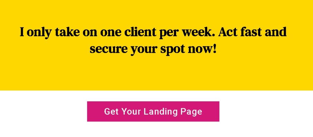

Here, I created urgency via:
- Limited availability.
- A time-sensitive, reduced offer.
Make It Stand Out
While you create landing page, ensure your CTA button stands out with contrasting colors and clear design.
A bold, visible button encourages users to act quickly.
See how it stands out in the image below:


Use Social Proof
Boost trust by adding social proof near your CTA, such as testimonials or “Join 10,000+ happy customers.”
Social proof reassures visitors making them more likely to act.
Besides this, you can utilize testimonials, offer limited time discounts or bonuses and create a clear value proposition to communicate effectively and boost the effectiveness of your CTA.
Hero Section: Images, videos, and first impressions
The hero section is the first thing visitors see on your landing page.
Just like thumbnails and first few seconds on YouTube videos, the hero section serves as a visual hook. If it’s compelling, it grabs attention and invites visitors to dive deeper into your page.
Here’s the sample hero section:


Opps! There’s no image. You know, I’m camera shy.
It’s a bad hero section.
We already discussed some of its elements above including captivating headline, sub headline & prominent Call to Action prompt.
Besides this, it includes high quality visuals (images or videos), visually appealing background & supporting text highlighting key benefits or features of your offering.
My suggestion is to not overload the hero section with too much information. I prefer to keep it minimalistic.
A simple setup could be a video with a heading and a call-to-action button.
Alternatively, you can use an image, headline, sub headline, urgency element, and a CTA.
Ultimately, it’s about your creativity. The hero section should reflect your brand while making a strong connection with visitors.
Digestible Copy
As you create landing page, you’d need copy to communicate your message.
Make sure your copy is digestible.
Visitors often skim instead of reading everything, so your message needs to be clear and concise.
Short paragraphs, simple sentences, and easy-to-read sections make your content approachable and engaging.
Look at this example below:
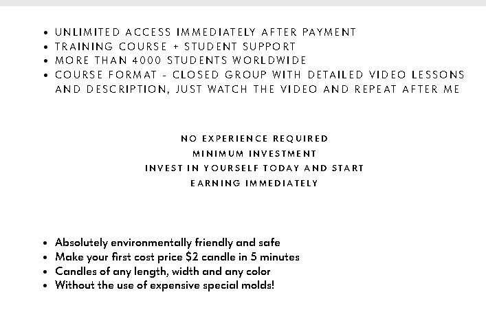

Ask yourself:
Would this copy engage you? Does it clearly communicate value? Would you want your landing page to look like this?
Now, check this out:


I bet you want your copy to be like this, don’t you?
It’s not that difficult.
If you’re on a tight budget, use ChatGPT to write your copy.
Find a sample you like, add your story and ask GPT to help you draft something similar. Keep refining the content until you’re happy with it.
But if you want the best results, hire a professional copywriter. Yes, it may cost a few hundred to a few thousand dollars, but the potential return on investment through higher conversions is worth it.
Conclusion
In this chapter, we covered the essential elements to create high-converting landing page: a compelling headline, clear sub headline, strong call-to-action, impactful hero section, and digestible copy.
These are crucial for engaging visitors and driving conversions.
Of course, there are other elements that contribute to success, but mastering these basics sets a strong foundation for crafting high converting landing page for your business.
Optimizing for Conversions
It’s time to fine-tune your landing page for even better results.
This step is all about optimization—where you dive into A/B testing to see what works best and ensure your page is fully mobile-responsive.
These adjustments are key when refining a high-converting landing page structure.
So, let’s get into how you can turn your landing page into one that converts at an even higher rate.


A/B Testing: Optimizing headlines, CTAs, and design elements
A/B testing is a method to compare two versions of a webpage to see which one performs better. Instead of guessing what might work, you can use data to make informed decisions.
For example, let’s take a look at the hero section of the sample landing page.


You might consider changing the color of the CTA button from blue to green.
A simple switch like this can have a significant impact on conversions.
Additionally, think about testing two headlines: “Snatch, Ignite, and Dominate” versus “Limited Time Offer!” Each option carries a different tone, and it’s essential to see which one resonates more with your visitors.
Perhaps, you have another version of a landing page designed by your friend & it’s a good idea to see which one converts better.
So, how do you do that?
Well, it’s easy. You run A/B tests.
By doing so, you can rely on data and analytics rather than instinct to determine the best elements or best version of your landing page making sure your business got the one that’s high converting.
How A/B Testing Works?
With A/B testing, you split your audience in half.
One group sees Version A, while the other sees Version B.
You track how visitors interact with both versions over a week or a month. Then, you analyze. After analyzing the results, you determine which version performed better.
Finally, you implement the necessary changes to optimize your landing page. And you iterate, meaning keep testing different elements for better optimization.
Seems complex, right? How to do A/B Testing?
Don’t worry!
You don’t need to be a professional to do this.
WordPress offers both free and paid plugins for A/B testing, which are perfect for optimizing landing pages. You can simply watch a short YouTube tutorial, install and activate the plugins, set up the settings, and you’re done.
Yeah! It’s that easy. However, if you want to experiment with multiple elements at once or test your entire website, you’ll need to use paid plugins.
Some of the free plugins include Nelio A/B Testing and Split Hero, while more advanced paid options, like Optimizely and Convert, provide extra features for deeper testing.
Mobile Responsiveness: Ensuring a seamless experience


Did you know that about 60% of global web traffic comes from mobile phones?
You definitely don’t want to miss out on such a large group of potential customers!
By making your landing pages mobile-friendly, you could nearly double your conversions. Double! Can you believe that?
Before delving into ways to create landing page that’s mobile responsive,
let’s see what mobile responsiveness really means.
Here, I’ll show you two screenshots: one of the websites on a laptop and another on a tablet.
Now, ask yourself:
Is it responsive across all devices?
A mobile-responsive design ensures that your landing page adapts to different screen sizes, providing an optimal viewing experience for users on any device.
How to Create Landing Page Responsive for All Devices
To make your landing page more responsive in WordPress, follow these steps:
Choose a Responsive Theme
Start with a theme that is mobile-responsive.
A great example is the Astra theme, known for its speed and flexibility.
Other high-quality options include Divi and GeneratePress.
Remember, you need to consider it before you start to create landing page.
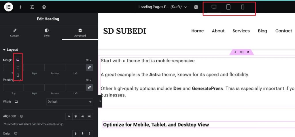
Optimize for Mobile, Tablet, and Desktop View
WordPress offers options for mobile view, tablet view, and desktop view.
You can set different font sizes, heights, and features for various elements based on the device.

Adjust Font Sizes And Buttons
Make sure your font sizes and buttons are easy to read and click on mobile devices.
Adjust these settings in your theme or page builder.
Optimize Images
Use responsive images that adapt to different screen sizes.
Plugins like Smush or ShortPixel can help with image optimization.
Simplify Navigation
Ensure your navigation is user-friendly on mobile.
Consider using a hamburger menu across all devices for a cleaner look.


Common Mistakes to Avoid
In this chapter, we’ll cover some common mistakes to avoid when you create landing page.
From cluttered designs to neglecting mobile users, these missteps can hurt your conversions.
If you want your landing page to succeed, avoiding these pitfalls is key.
Let’s dive in and explore how to keep your landing page clean, focused, and optimized.


Cluttered Design: less is more
Before we dive into the details, take a look at these two examples:
Test Yourself!
Which one holds your attention? Which one feels easier to engage with?
If you chose the minimalist page, you’ve just experienced less is more when it comes to design.
Understanding Why Less Is More?
A cluttered design confuses visitors and makes it hard to find what they need. When faced with too many options, people often feel overwhelmed and may leave the page.
In contrast, minimalist design shines by providing a clear focus. It makes it easy for users to understand the message and take action without distractions.
But don’t just take my word for it!
According to a study by Google,
users form an opinion about a website’s visual appeal in just 50 milliseconds. Clean and simple designs are perceived as more trustworthy and professional.
In fact, well-structured landing pages can boost conversions by up to 33% simply by eliminating unnecessary clutter.
Too Many CTAs: Keeping your focus clear
“Buy! Grab my free guide. Book a seat for my free masterclass and a paid one-on-one session. Oh, don’t forget to join our free Discord community! And… buy this product too!”
Sound overwhelming? It is.
Now, imagine a different landing page which implies: If you’ve got a XYZ problem, grab my free guide now!
One simple message, one clear CTA: Grab it for free.
Which one is more likely to drive conversions?
Let’s make it even simpler.
Which one do you think would convert better?
If you guessed Landing page 2 with a single CTA,
you’re not alone, my friend.
According to Google,
landing pages with a single, clear CTA can increase sales by approximately 1,617%.
Why?
Because when people know exactly what action to take, without distractions or confusion, they’re much more likely to follow through. Too many CTAs, on the other hand, create hesitation and make users feel overwhelmed.
Keep it simple, and your conversions will thank you.
What If I Have Multiple Offers?
If you have multiple offers, don’t worry—you can still keep your landing page clear and focused.
Prioritize Your Offers
Start with one primary call-to-action. This should be the main goal of your page, like downloading a free guide or booking a consultation.
Your secondary offers? Keep them subtle. Let them be options, not distractions.
Use Separate Pages
If you’ve got several offers, consider creating separate landing pages for each.
This way, every offer gets the attention it deserves without cluttering your main message.
Time Your Popups
Another way is to use timed popups.
After someone engages with your main offer, show them your secondary offers, like joining a masterclass or booking a session.
This keeps your landing page focused, while still promoting all your offers—just not all at once.
And when it comes to landing pages for small businesses, focus is key.
When visitors have clarity, conversions follow.
Here's a landing page idea I found particularly interesting.
It creatively uses separate landing pages and timed popups to present multiple offers.
Why is this design effective?
Because while presenting multiple offers, it keeps the layout clear, intuitive, and user-friendly. Each page takes the user one step further into the funnel, with every offer serving a distinct purpose.
You may have multiple offers, but you can still keep your landing page simple and clear. Take inspiration from the above landing page example.
Creativity is what truly matters.
Instead of copying, use this as a guide to create your own unique design.
Neglecting Mobile Users: How to avoid alienating mobile traffic
Almost 60% of web traffic comes from mobile devices.
You don’t want to miss out on such a significant portion of potential customers, do you?
Neglecting mobile users can lead to losing many visitors and negatively impact your business.
To keep your site responsive, focus on simplifying navigation, optimizing images, and testing your site on various devices.
Do this while you create landing page.
For more information on mobile responsiveness and effective strategies to ensure your site works well on all devices, be sure to check out Chapter 5 of this blog.
Measuring Success
Now that your business has got a landing page,
it’s time to find out whether it’s a hit or a flop.
In this section, I’ll help you track key performances of your landing page.
And at the end, I’ll share a hack to use performance insights to iterate and improve your landing page.
Let’s dive in!

Is it really important to measure to create landing page?
I won’t answer that just yet!
Let me share with you a story.
John and Alice both own gyms across the street from each other, and the competition is fierce. John even went as far as copying Alice’s landing page, making an exact replica.
But here’s the difference: Alice measures everything. She knows her conversion rates, bounce rates, and customer acquisition costs. She’s using real data to fine-tune her page. Her goal is clear—she’s aiming for an 8% conversion rate by this Halloween, and she knows exactly what steps to take to get there.
John, on the other hand, isn’t tracking anything. He has no idea how his landing page is performing. No metrics, no insights. He’s making changes at random, hoping something sticks.
Halloween arrives, and both need 1,000 conversions.
Alice has a precise plan—she knows how much to spend, how many people will visit her page, and how many will convert. She’s confident in her numbers.
John? He’s just throwing money at ads, hoping for the best. He doesn’t even know how long it takes for a customer to convert, so he keeps spending more and more, with no clear strategy.
Which approach would you rather take?
Tracking Performance
Now that you appreciate Alice,
let’s bust a few myths about tracking landing page performance.
You don’t need to be a developer.
You don’t need to know how to code.
You don’t have to be tech-savvy.
In fact, it’s simple, fun, and completely free to do.
So, what’s the catch?
The only thing you really need is traffic.
Without people visiting your landing page, tracking metrics is like trying to measure something that doesn’t exist. If your website doesn’t have any visitors yet, there’s nothing to track.
However, if you plan to run paid ads or promotions right from the start, tracking performance is crucial—even if your site is brand new.
Let’s break down the key metrics you should track.
Conversion Rates
This is the percentage of visitors who complete the desired action on your landing page, like signing up for a newsletter, making a purchase, or filling out a form.
For example, if 100 people visit and 10 take action, your conversion rate is 10%. It’s a direct measure of how well your page turns visitors into leads or customers.
Engagement
Engagement tracks how visitors interact with your landing page. Are they clicking buttons, watching videos, or scrolling through the content?
The more visitors engage with your page, the more likely they are to convert.
High engagement often signals that your content resonates with users.
Bounce Rates
A bounce rate measures the percentage of visitors who leave your landing page without taking any action.
Imagine someone walks into a store, looks around for a second, and then leaves. That’s a bounce.
A high bounce rate might mean your page isn’t delivering what visitors expect, or there are distractions preventing them from staying longer.
While these are the core metrics for most landing pages, the specifics vary depending on the type of business.
For example,
if you’re running an eCommerce site, you might focus on metrics like average order value or cart abandonment rates. But if your goal is to collect emails through landing pages for small businesses, then conversion and engagement will be your top priorities.
By tracking these key metrics, you’ll have a clearer picture of how successful your landing page is, allowing you to optimize them for even better results.
Best Tools: Google Analytics, Hotjar, and more
Now, the big question is:
how exactly do I measure these performances?
Thankfully, there are plenty of free tools available to help you track the performance of your landing page.
Some of the best options include Google Analytics, Ubersuggest, and Hotjar.
While Ubersuggest and Hotjar offer free versions, they come with limitations—unpaid users only get access to basic analytics.
That’s why I recommend using Google Analytics.
What could be better for tracking your site’s performance on Google than a tool designed by Google itself? Plus, it’s entirely free!
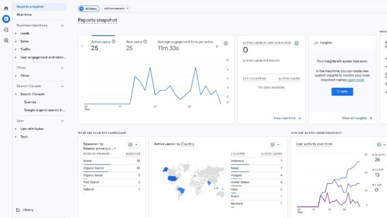
On top of that, Google Analytics offers pre-defined templates that automatically track key metrics like conversion rates, bounce rates, and engagement.
The best part? The dashboard is incredibly user-friendly, so you’ll have a smooth learning curve even if you’re new to tracking.
Take a look at the Google Analytics dashboard:

Isn’t it simple?
With Google Analytics,
you can easily monitor the performance of your newly created landing page and make data-driven decisions to optimize your results.
Learning Google Analytics
I won’t go into a step-by-step guide on setting up Google Analytics—honestly, that could fill an entire book.
Thankfully, Google offers a complete Google Analytics course that walks you through everything you need to know.
Not only is the course simple and beginner-friendly, but you also receive a certification upon completion, which can be a valuable asset for your business.
The course is well-structured and explained in a way that’s easy to follow, so you can get started without feeling overwhelmed.
Check this out: Click Here
Iterate and Improve: Using data to refine your Landing page
Tracking your landing page metrics is just the first step.
The real value comes from using that data to improve your page. This process of iteration—making small changes and testing their impact—can significantly boost your results.
It’s like you create landing page, track performance & use the performance record to recreate it. And you do this always.
For example,
if engagement is high in the introduction but drops sharply in the pricing section, it signals a potential issue. You can use this insight to tweak the design, wording, or flow to keep visitors interested.
Another scenario could be strong engagement in your services section and on the “Make Payment” page, but little interaction on the thank-you page. This might suggest there’s friction preventing users from completing their purchase, indicating areas for improvement.
By continually analyzing and iterating based on user behavior, you can create landing page that’s high converting & user-friendly.
Bonus Tip: A/B Testing for Continuous Improvement
Once you’ve gathered data from your landing page, a great way to take it further is by using A/B testing.
This technique allows you to test two versions of your page—changing one element at a time (like headlines, images, or CTAs)—to see which performs better.
For creating a top-notch landing page, this method is invaluable.
Small tweaks can make a huge difference in conversions, and A/B testing helps you identify what resonates best with your audience.
Start simple: test different headlines, button colors, or even the placement of your call-to-action.
Over time, you’ll refine your page based on data, leading to even better results!
Working With a Professionals
Creating landing page shouldn’t be overwhelming.
However, if you’ve got no time to do all this by yourself,
don’t worry—you can always hire a professional to do it for you.
In this section, I’ll guide you through the steps to find the right freelancer for your project while sticking to your budget.
Let’s dive in!


Understand Your Project and Budget

Define Your Project
First, be clear on why you need a landing page and what features you want.
This determines the budget.
Each additional feature, like payment gateways or professional copywriting, can increase the price from a few hundred to thousands of dollars. The more complex your needs, the higher the cost.
Set Your Budget
How much are you willing to invest?
Are you looking to spend a few hundred dollars, or do you want the best and are willing to spend more for additional features and quality?
My Advice
Don’t be overly conservative with your budget.
A well-designed landing page can double or even triple your business revenue.
It’s an investment that pays off, so it’s worth considering a larger budget for higher-quality results.
How To Choose Between Freelancer & Digital Marketing Agency


Freelancer
Hiring a freelancer to create landing page can be budget-friendly, with landing page prices ranging from $100 to $1,000 or more.
Freelancers often provide personalized service and quicker communication, managing the project themselves.
However, they may have limitations in resources, which could affect the quality if you need additional features or revisions.
Digital Marketing Agency
In contrast, a digital marketing agency typically charges between $2,000 to $10,000 or more for a landing page.
With a team of experts, including copywriters, web & graphic designers, and SEO specialists, agencies offer a comprehensive approach that ensures every aspect of your landing page is optimized for success.
However, this comes at a higher cost and may involve longer turnaround times.
Which One to Choose?
Your choice should depend on your project needs and budget.
If you have a clear vision and a limited budget, a freelancer might be the best fit.
While if you’re looking for a well-rounded solution with expert support, consider a digital marketing agency.
Finding the Agency and Freelancer
You can find freelancers to create landing page on platforms like Upwork, Fiverr, and Freelancer.com.
When choosing a freelancer, be sure to check the features of their landing pages, read their reviews, and consider those at the top, as they often deliver similar results.
For digital marketing agencies,
explore Clutch.co, Google Search, and LinkedIn. Review their portfolios and client feedback to ensure they align with your needs, as agencies might vary more in terms of services and outcomes.
Don’t underestimate the power of networking! Ask for referrals from other business owners or attend industry events to connect with potential agencies or freelancers.
Working With Me
Luckily, I specialize in creating landing pages.
And I’m offering my compete landing page solution starting at just $197.
This package includes A/B testing, Google Analytics integration, and payment gateway integration, along with a professional-looking design and copywriting.
Since I handle everything myself, I can only take on one project per week. This ensures that I can dedicate my full attention to your needs.
If you’re interested in my landing page services, you can learn more here.
Conclusion
Here,
I’ll share a simple roadmap to help you create your first landing page with confidence.
Let’s get started!


To support your journey,
I’ve prepared a simple roadmap that outlines a simple path for you to create landing page.
You can download & use it.
Powered By EmbedPress
Always remember to prioritize continuous improvement.
Regularly analyze performance metrics and iterate based on user feedback.
Best of luck and may your landing pages thrive!


